Project
The project goal is to improve student engagement and retention rates by designing and developing an aggregated dashboard for LoudSight Analytics. The dashboard will present key metrics and insights to advisors and instructors in a concise, actionable, and intuitive manner. The focus is on providing actionable insights on student performance at the right time to help universities achieve their goals.
Product : Loudsight - Student analytics
Market : Learning management systems, Edu.tech
Role & Responsibilities : Problem analysis, feature usage analysis, user insight generation, wire-framing, UX design, mockup and user testing, design alterations, UI design and implementation support.
Tools : Photoshop, Illustrator, Axure RP, Figma, Keynote
Cross functional teams: Project management, business analysis, data science, front end and backend development, quality assurance (QA) .

Product background
What is Loudsight?
Loudsight is BNED LoudClouds student analytics product. LoudSight's analytics engine helps in improving student engagement and retention rates by capturing and analysing key behavioural and performance metrics. It provides reports and visual representation of students performance parameters that can be used for identifying vital predictors of success, and can provide key insight at the point of instruction.
The Premise
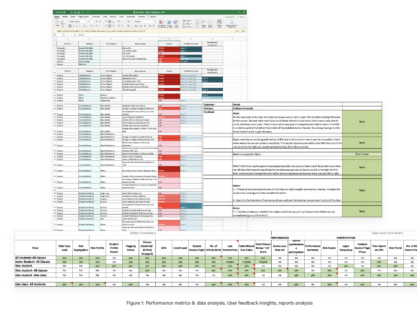
Loudsight provides large number of performance metrics and reports generated from student data. However, feedback from our customers suggests that users only utilises a fraction of these reports. Usage analytics further indicated that the selection of reports is limited by generic dashboard design and data overload on the main screen. To address this, the product needed a streamlined and intuitive dashboard that accommodates the unique needs of different user roles, ultimately improving engagement and retention rates.

Product Research
Research Questions
Research & analysis
User feedback, Product usage and Feature utilisation analysis, Blog studies.
UX Research questions:
1. What are the key behavioural and performance metrics that impact student engagement and retention?
2. How can Loudsight's student analytics product be optimised to improve user engagement and adoption?
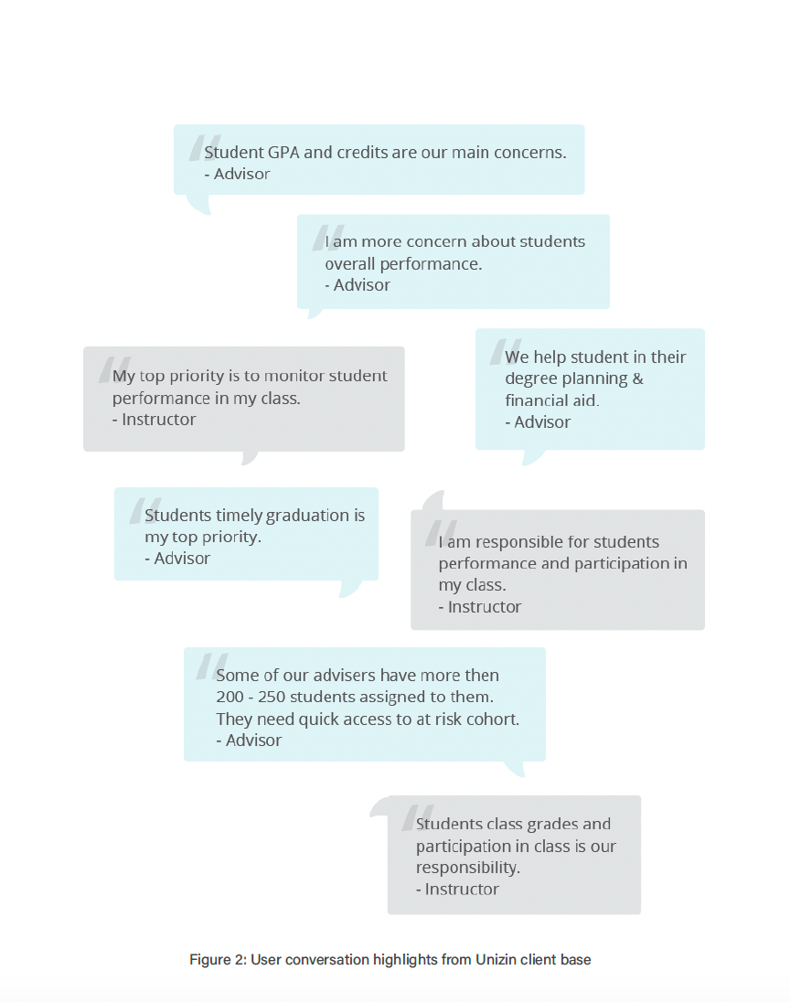
3. What are the specific needs and pain points of advisor?
4. What design elements and features are necessary for a customised dashboard that is intuitive and actionable for the user?
5. What are the new data sources and features to enhance loud sight’s effectiveness?

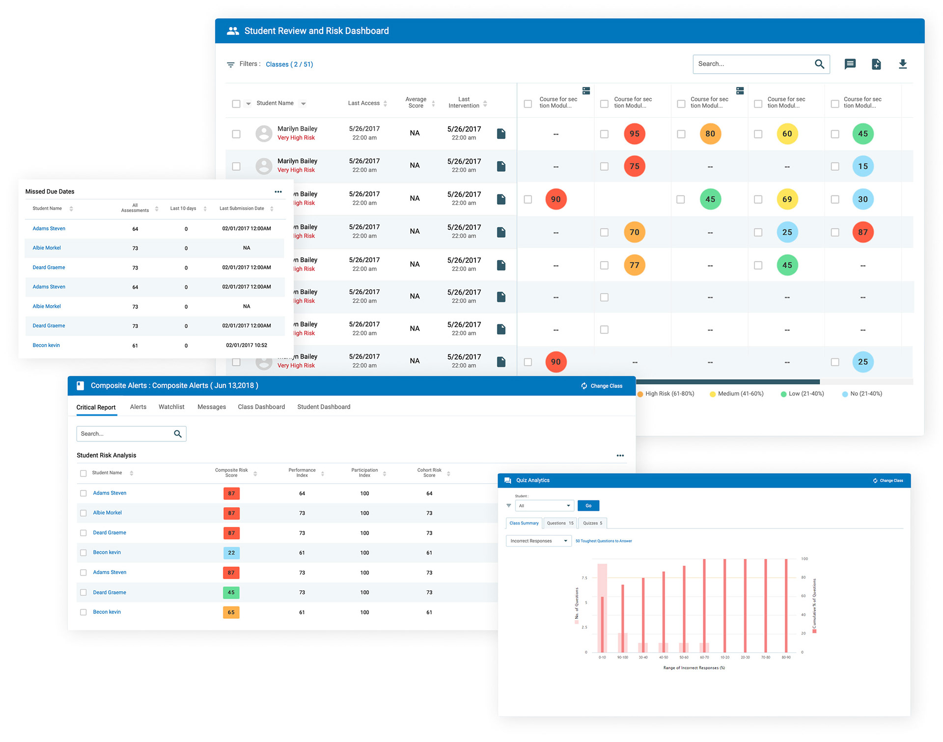
Aggregated risk dashboard
Need for the Aggregated dashboard (pain points):
• Advisors have large caseloads of students from multiple classes and campuses
• Current dashboard limits view to only 15 classes, affecting user experience
• Advisors want a rolled-up view at program level for important metrics
• Advisors view their students using benchmarks not currently available in the application
• Need for feature expressed by multiple customers and competitors
• Advisors want to filter student cohort for actionable data
Product Roadmap and Strategy Alignment
• Broadens our product offering and aligns with long-term institutional analytics goals
• Utilises SIS data through N2N (node to node) integration to deliver course completion, grade performance, and YoY persistence insights in an aggregated model
• Supports our IDP offering
• Aligns with our mission to provide valuable and actionable insights to users
• Fits into our product roadmap as a critical feature to meet the evolving needs of our customers and improve our overall product competitiveness
• Enhances product parity with industry leaders such as BB and Canvas

Aggregated risk dashboard
Objective:
•Gain insights into the daily routines, job requirements, and challenges faced by student advisors and instructors
•Identify product usage patterns and task needs
Advisors want to know:
•Which students need attention the most?
•Which at-risk students have not been contacted recently?
•Who has not been checked on in some time?
•How is a student doing across all enrolments?
•Who has not been active for over a week?
•How are students on my tracking list doing?
•How are recently contacted students performing?
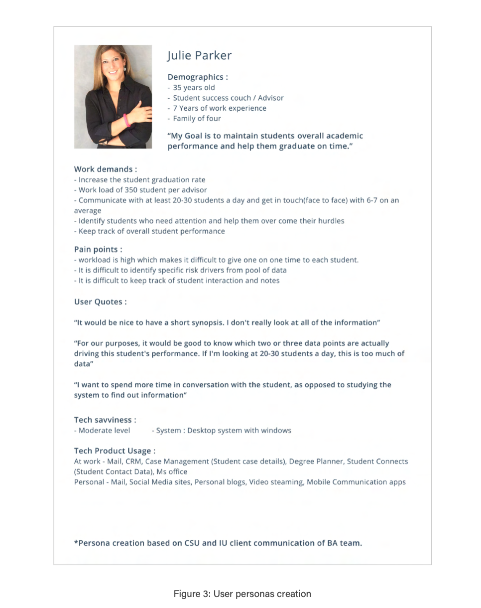
Goals of a student Advisor:
• Aid in degree planning
• Assure timely graduation/course completion
• Track progress towards academic and career goals
• Offer career assistance
Key dashboard metric for Advisors:
Overall performance data of students

UX PROJECT PLAN
Overall goal: Concise, actionable and intuitive dashboard.
Product improvement areas:
• Simplified user experience and workflow
• Simplified data dictionary (minimised variables)
Approach:
• Provide a cohort level summary with access to student level drill down (Reverse pyramid)
• Provide a cohort level summary with access to student level drill down (Reverse pyramid)
User needs:
• Identify and drill down to high risk cohorts based on different variables
• Global level performance data
• Quick insight into risk drivers/parameters (Actionable insight)
• Channel to communicate with students or cohorts
Key features:
• Key performance indicators (KPIs): Highlighting the most important metrics to predict at-risk student cohorts based on university-specific needs.
• Enhanced filtering options: Multiple filtering options to fit users' daily usage needs.
• Interactive data visualisation: Includes charts and graphs to help users interpret and analyse data.
• Actionable insights: provides insights to help faculty and administrators intervene and support struggling students.
• Quick access to actionable features: Provides quick access to action-oriented functionalities like note-taking, flagging, and messaging.
• Alerts and nudges: Quick access to alerts as it is one of the most used feature of the current product.

Page flow & Feature mapping
Goal: Simple & centralised access point
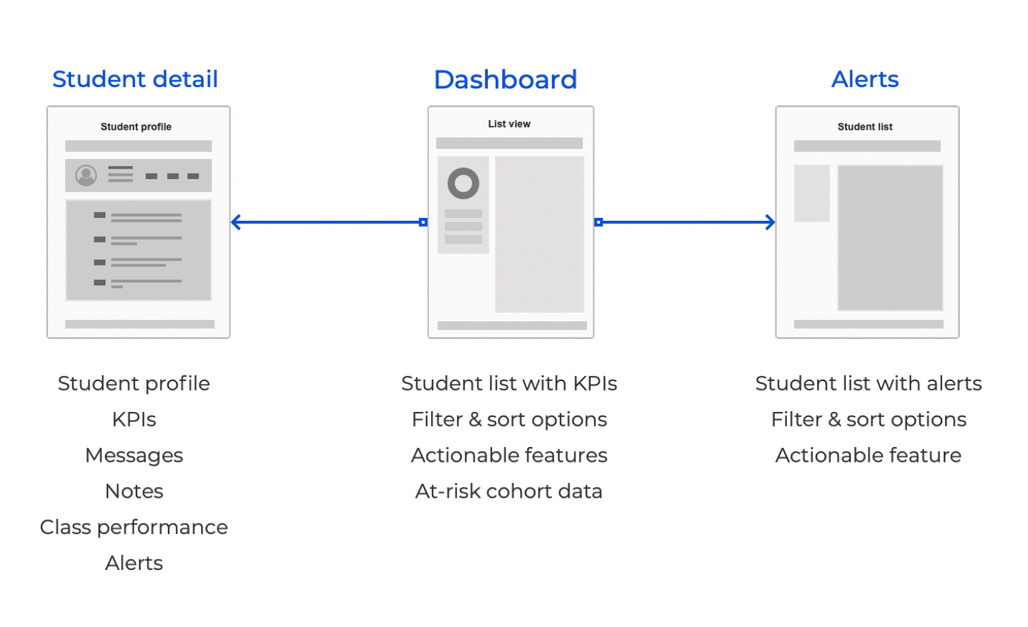
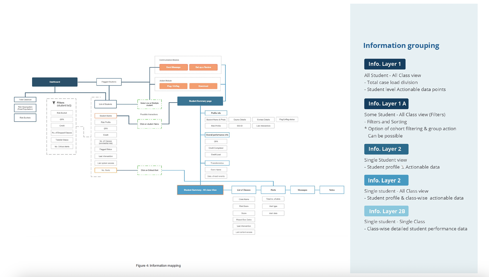
Updated information flow and data grouping

wire-frames
Concept generation
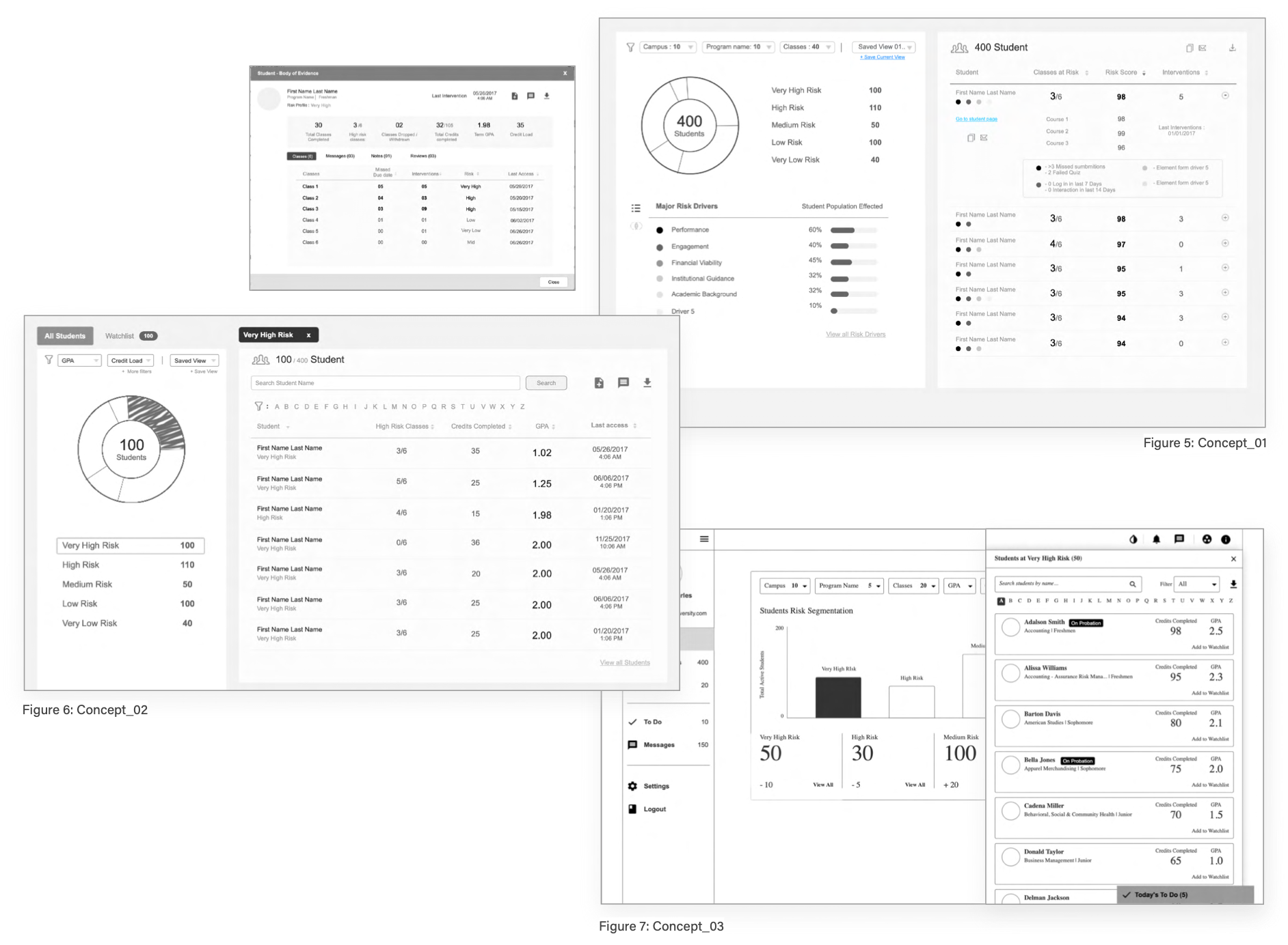
Low fidelity wireframes:
Multiple low fidelity wireframes were created to quickly test out the concepts during the user interactions.
Some of the wireframe links:

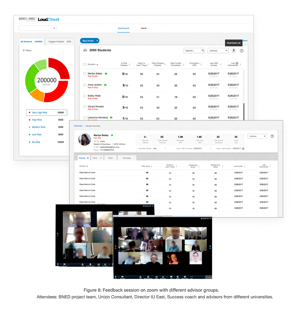
User feedback
Dashboard overall:
• It's good to have interactive actions upfront and instantly accessible: Advisor workload is high, so adding another layer takes them away from taking action on student cohort
• Positive feedback from clients on having student access upfront
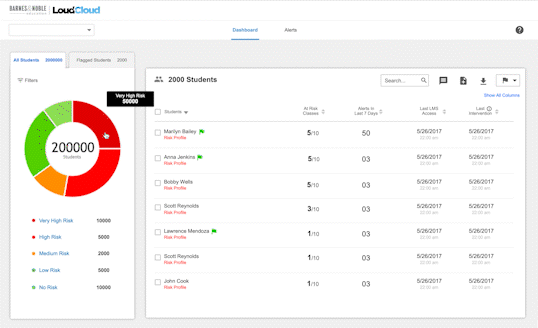
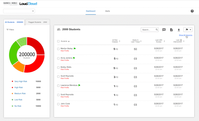
• List of Risk Drivers + Scores in text format is more direct and communicative
• Advisor wants more information on the student dashboard, including GPA, Grade, Risk Score, Fin aid, Email, Class Year, and Transfer Status : can we add some level of personalisation for data columns?
Features:
• Must-have features for advisor: Filters, Search, Sort, Message, Note
• Nice-to-have for enhanced experience: Onboarding, Save applied filter
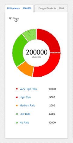
Doughnut Chart:
• Clients were happy with the doughnut chart representation and its filter functionality
• Can the doughnut chart be used to represent other variables as well?
Filtering/download:
• They would prefer filtering by GPA and Credits Completed, and also wanted the ability to filter by Risk Score
• They asked if they could download a list of students, with their email addresses, based on filters into a XLS or CSV format.

Mockups updates
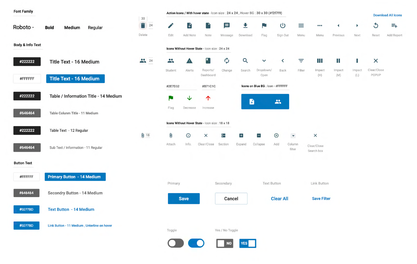
UI library
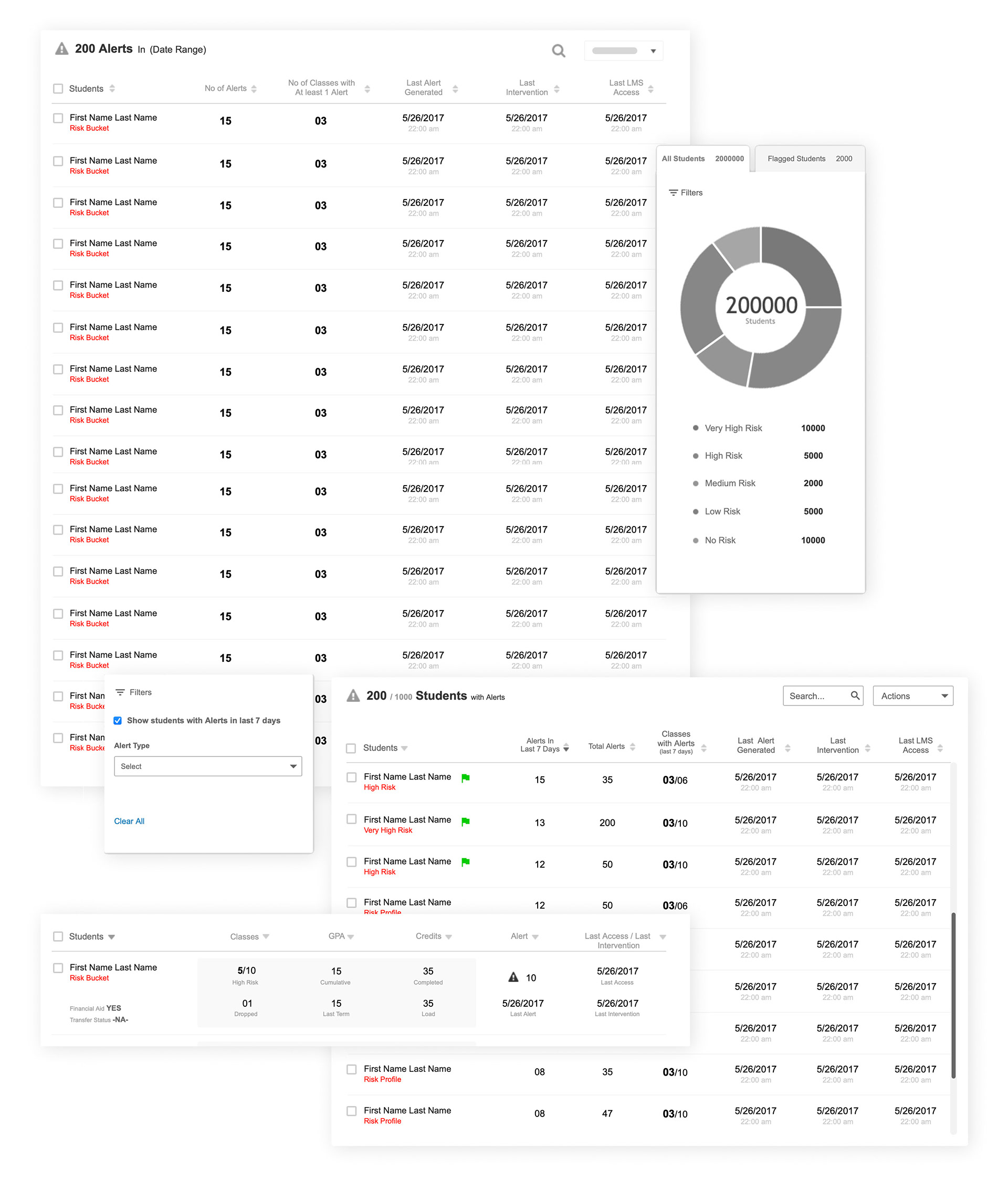
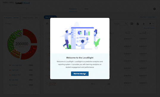
User onboarding tour for a quick start
Multiple filtering option
Quick filtering & interactive data visualisation for at risk cohort
Up to two extra personalised data point column add on option
*Final design of the product or prototypes can not be included in the portfolio because of company polices and NDA.

Conclusion
In conclusion aggregated risk dashboards interactive data visualisation and quick access to at risk students have generated positive response towards the product from advisors. It helped in increasing loudsight adoption rate and implementation of loudsight in the University of Alabama, El Paso Community College, and Florida State University have all seen positive outcomes, with retention rate increases ranging from 2.1% to 7.6%.
The design and user experience will prioritise simplicity, visual design, responsiveness, and accessibility to ensure that the dashboard is easy to use and accessible to all users. Overall, this project represents an important step forward in the ongoing efforts to leverage data and analytics to improve student outcomes.