Project
An information design poster to showcase space travel missions of different countries.
Product : A2 size information
Market : Space enthusiasts – People who have an interest in space or space travel
Role & Responsibilities : Information hierarchy, Layout design, Visual element design, Icon design, Visual language creation
Tools : Photoshop, Illustrator, Pencil sketching
Design brief
Using the data provided in the XL Sheet – SPACE_CRAFT_DATA.xl
Create an A2 infographic that showcases the information in an engaging and effective manner for the target audience. The content should be arranged in a format that clearly conveys the information and engages the audience. The layout and style should be visually appealing and highlight the content's hierarchy.
Select a color scheme that will effectively support the hierarchy and resonate well with the target audience. An effective typography strategy should be used to support the content's hierarchy, while also allowing for easy reading, understanding, and effective communication.

Design guideline
Approach
Key characteristic
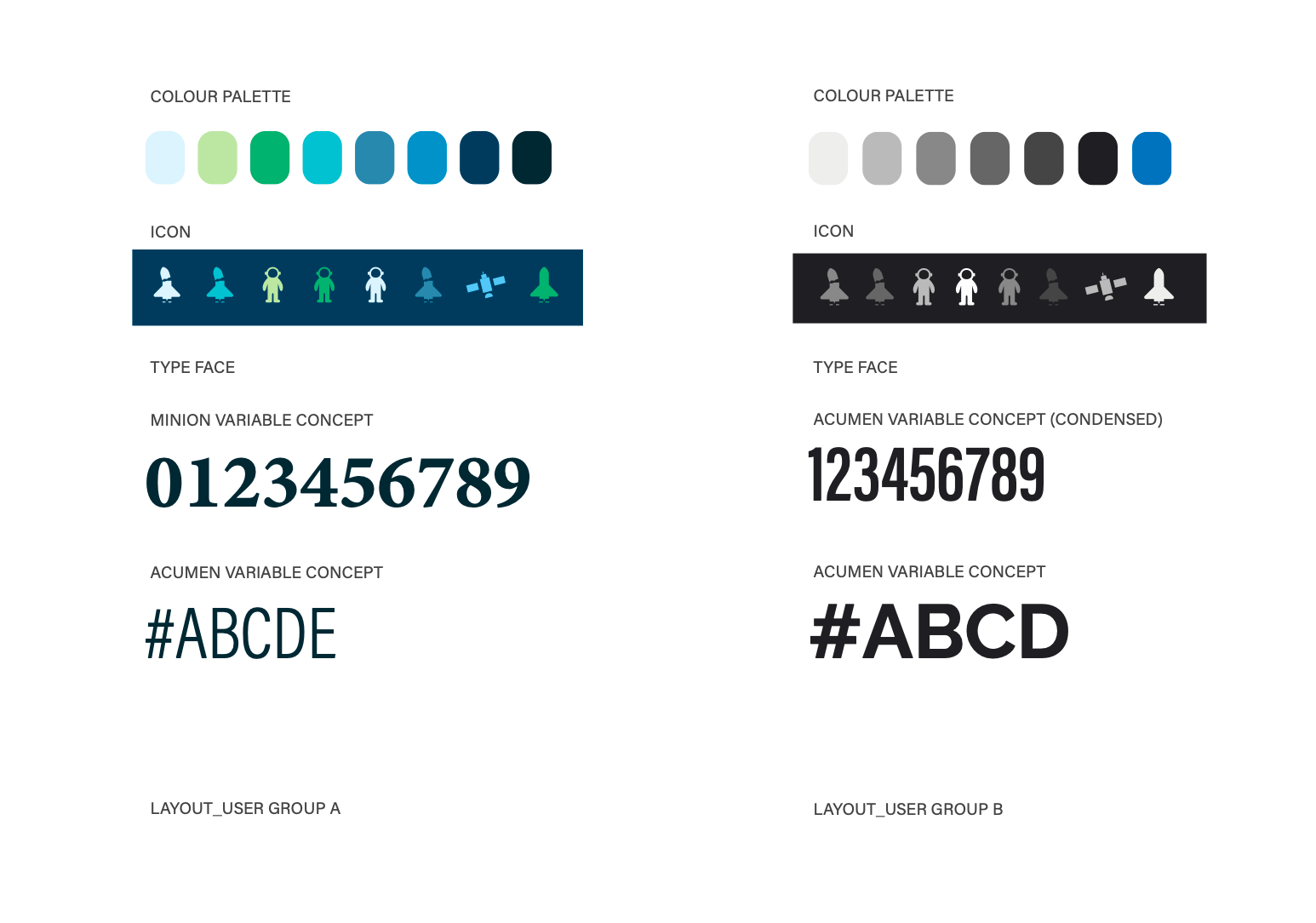
- Darker Colour palette
- Bold Fonts
- Heavily data driven and Informative
- Bold Fonts
- Heavily data driven and Informative
User
Space enthusiasts – People who have an interest in space, space travel, planets etc.
Further devision based on age:
Group A : Teens (13 to 19)
- Comparatively less detailed and simplified
- Brighter colour palette (still staying close to the overall space feel)
- Brighter colour palette (still staying close to the overall space feel)
- Variation in type face
Group B : 20+
- Detailed
- Darter colour palette - Strong bold type pace
- Darter colour palette - Strong bold type pace

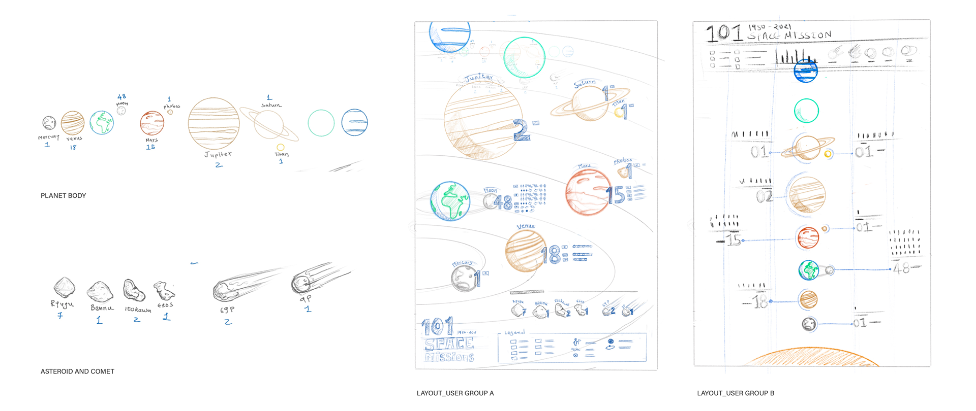
Ideation sketches

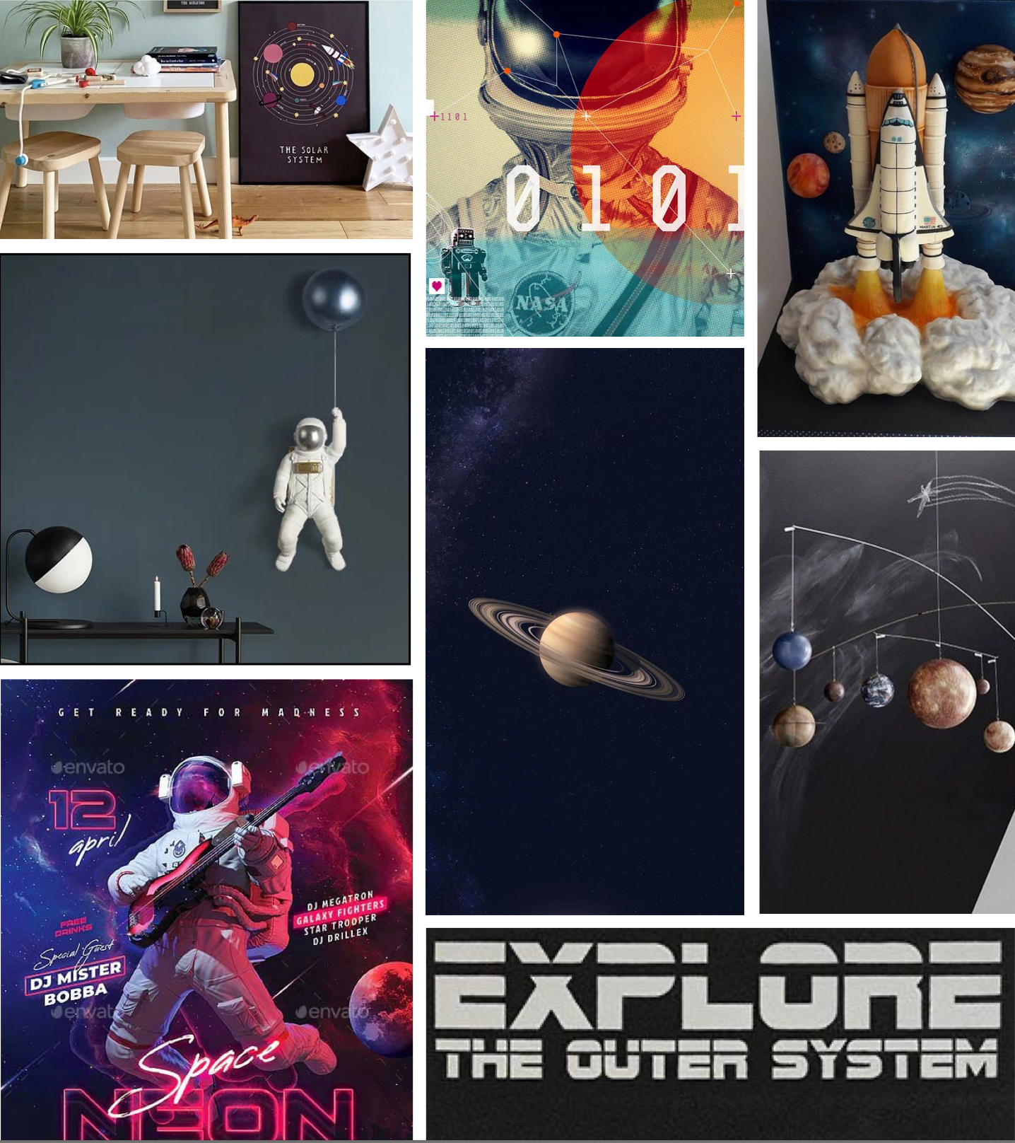
STYLE GUIDE & ASSET
Group A : Teens (13 to 19)
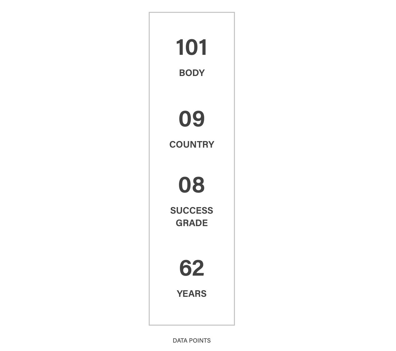
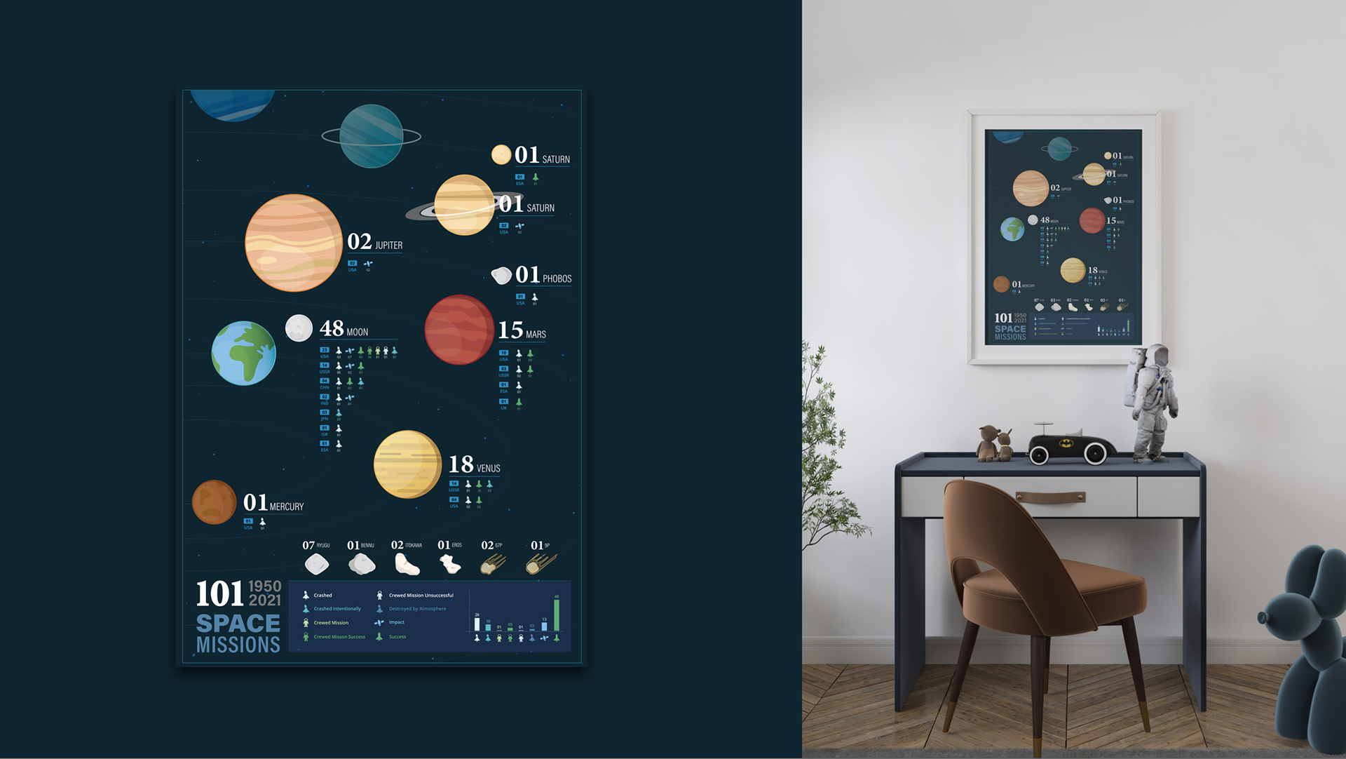
Information Hierarchy & Data points
- Total Number of missions
- Planet body name
- Country name & number of missions
- Number of different type of success grades
- Compression between types of missions (Chart)
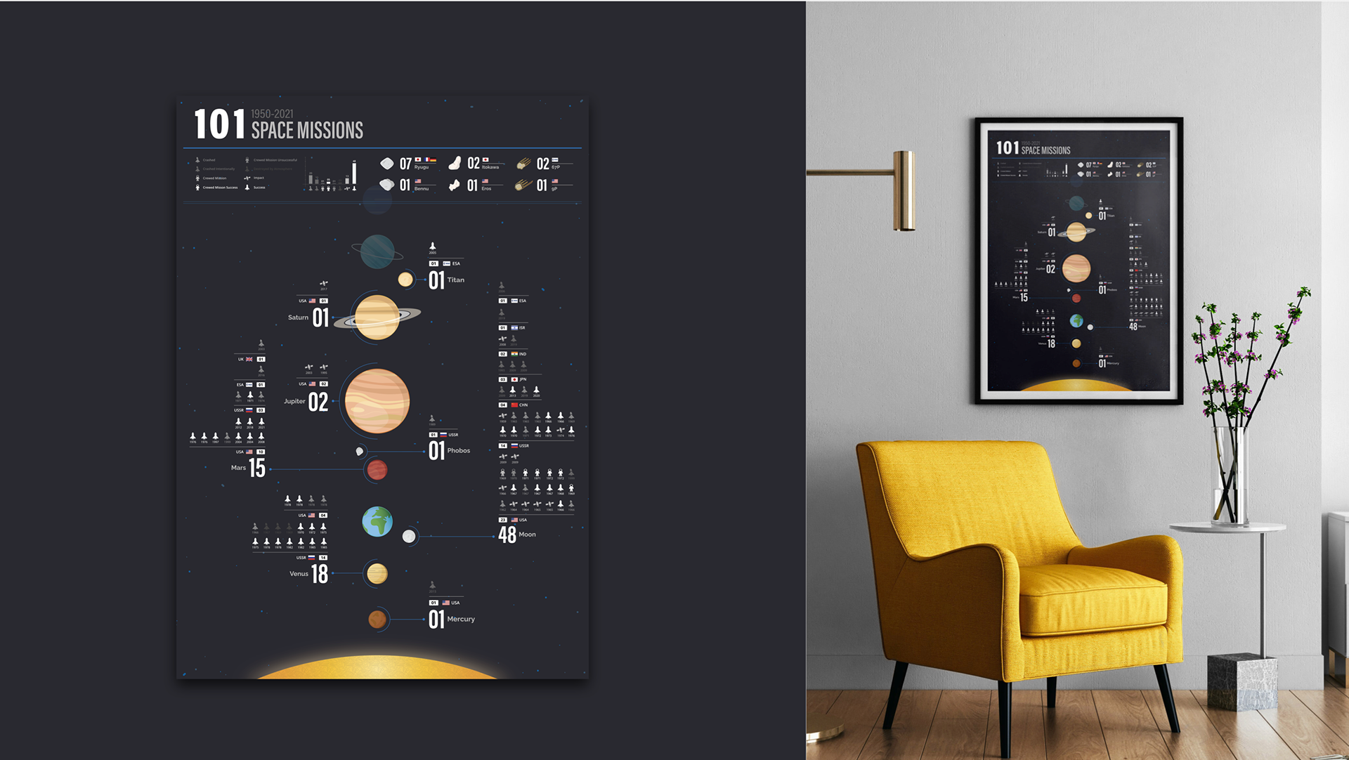
Group B : 20+
Information Hierarchy & Data points
- Total Number of missions
- Planet body name
- Country name & number of missions
- Year wise mission success grades
- Number of diHerent type success grades
- Compression between types of success grades (Chart)

Final design
Group A : Teens (13 to 19)
Playful look
- Feel of planet popping out by the use of unstructured planet placement.
- Bright tones of green and blue of secondary information which catches your eyes without over powering the main information.
- Strong focus on number of mission in the the title as well as the main information graphics.
- Less detailed and simplified in term of information overload.
Group B : 20+
Structured & Information heavy
- Structured layout with strong visual information Hierarchy drill down.
- Year wise country level missing success grade details.
- Smooth eye movement from primary to secondary data.