Project
This project was done as a part of Interface design course. The brief was to identify UI/UX issues with any current product and improve the its interface by using user centred approach.
Product : IRCTC - Ticket booking portal
Market : Online travel bookings / tourism
Role & Responsibilities : Problem area analysis & Identification, User journey mapping, Wireframes, User experience and interface design.
Tools : Photoshop, Illustrator, Axure RP, Figma, Keynote
Product (IRCTC)
IRCTC (Indian Railway Catering and Tourism Corporation) is the official online portal of Indian Railways, which is the national railway system of India. The IRCTC website is used for booking train tickets, checking seat availability, train schedules, PNR status, and other railway-related services.
The website also offers various services like online catering, tourism packages, and e-ticket cancellation. Passengers can make payments through various modes like net banking, debit card, credit card, and mobile wallet.
Purpose of the site
Primary
- Search and Book train tickets (online ticket booking)
- Booking History
- Cancelation/Changes/Refunds
- Train status
- PNR status checks
- Tour packages and special services
- Access to other services (external/internal links)
Product link: IRCTC E-ticketing
PROBLEM AREAS
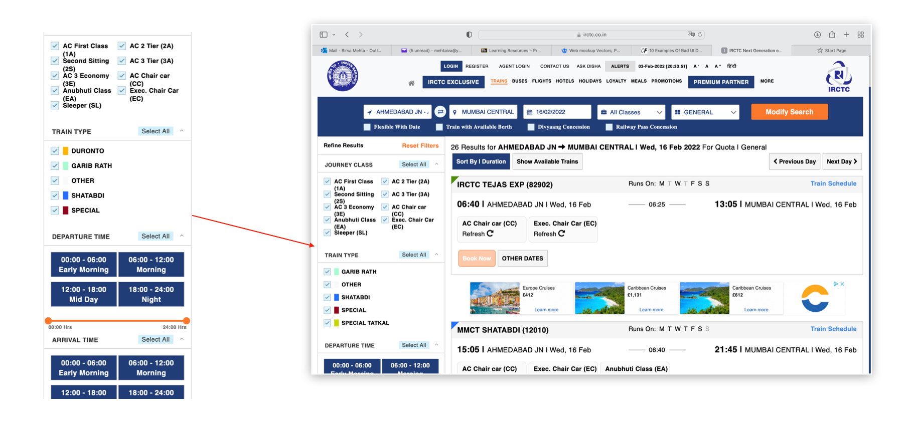
Information hierarchy
Information layering & Content placement
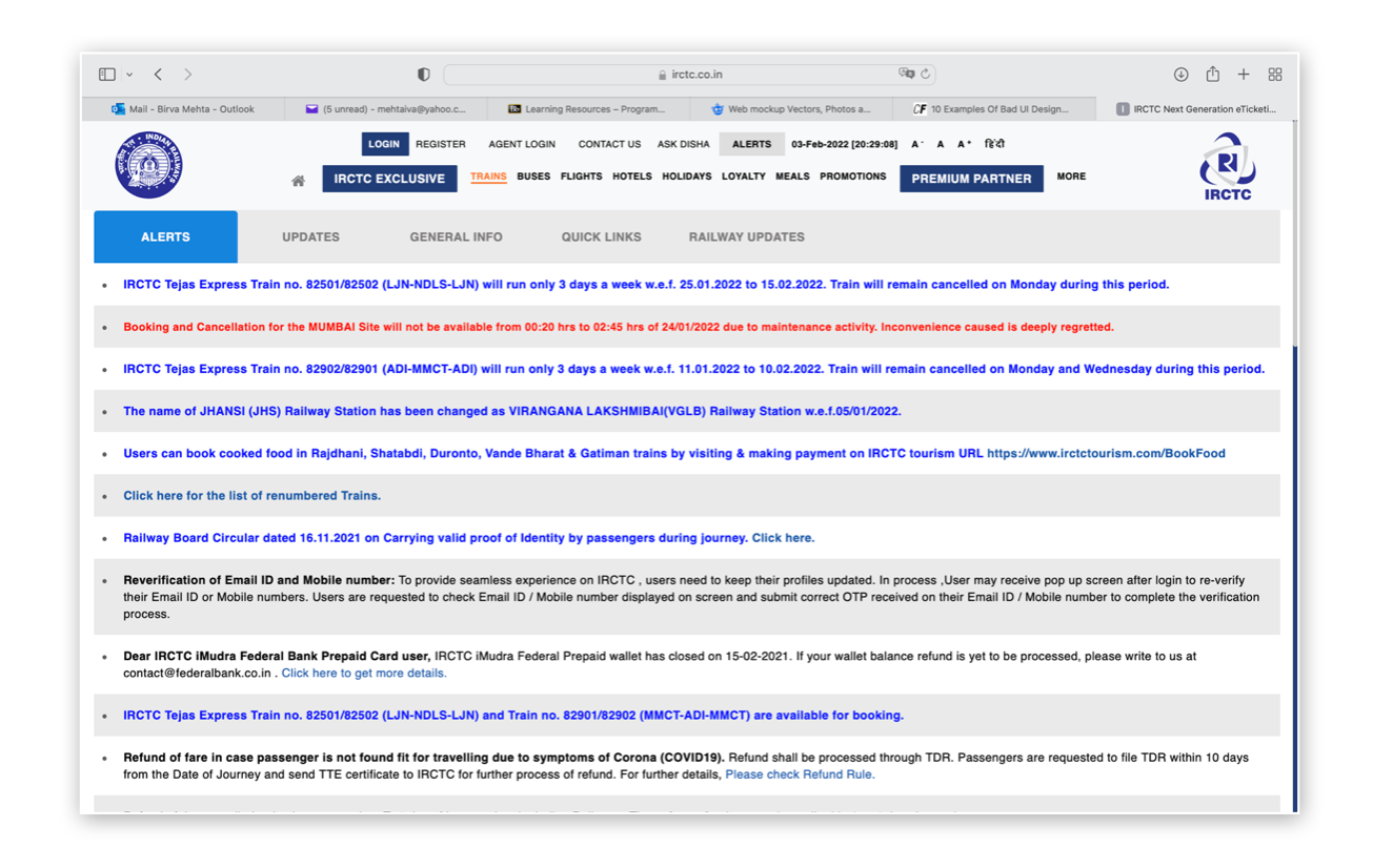
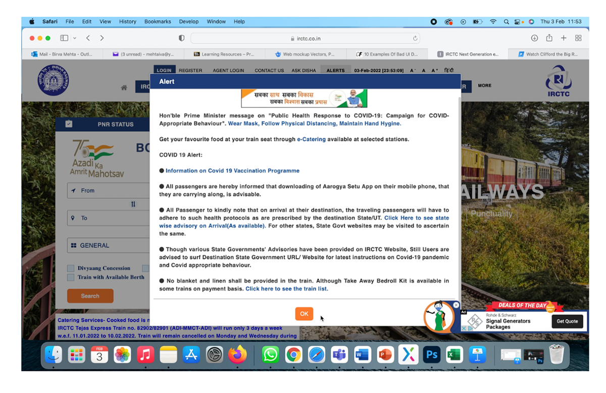
- Overload of information
- Missing information hierarchy
- Missing functionality grouping
- Missing content grouping
- Missing content layering (everything on one page)
- Function and UI miss match
Inconsistant & Misleading
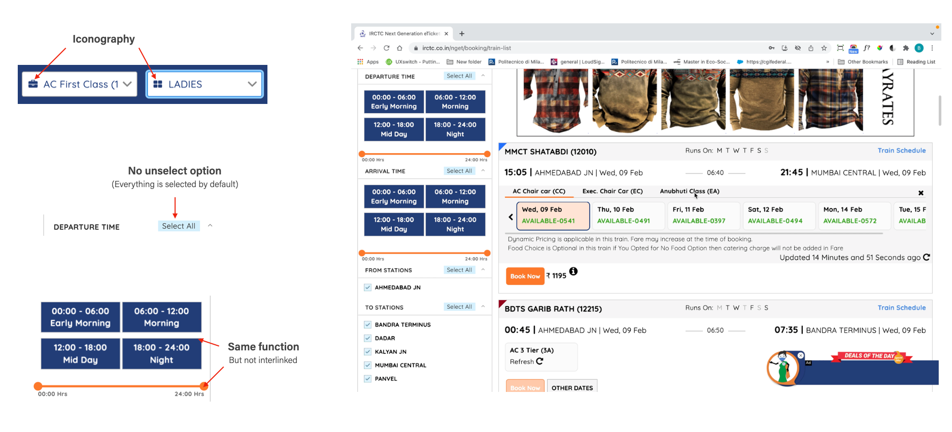
Many UI and Functional inconsistency
- Similar looking element for different functions
- Too many variation in UI elements across site
- Missing unified brand language
- Missing defined colour palette
Mobile experience
Products mobile and web experience is not streamlined

Current information and user journey mapping
New page & information flow
Goal
- Minimise the overload on the navigation bar
- Clean, Intuitive and to the point booking experience
- Improve filtering and sorting options for listing page
Wireframing
Design goals
- Clear
- Intuitive
- Function and flow consistency
Wireframe link : IRCTC Wireframe
User Interface
Design goals
- Intuitive User interface
- Standardised UI Library
- Clean
Prototype link : IRCTC prototype
Conclusion
The IRCTC UI re-design project aimed to improve the user experience and interface of the Indian Railways' online ticket booking platform. The new design focused on simplifying the booking process, providing users with more relevant information, and improving the overall visual appeal of the platform.
The resulting design includes a more intuitive navigation system, clear and concise information, and a streamlined visual design which will improve product usage experience.
